Published: 26.08.2024

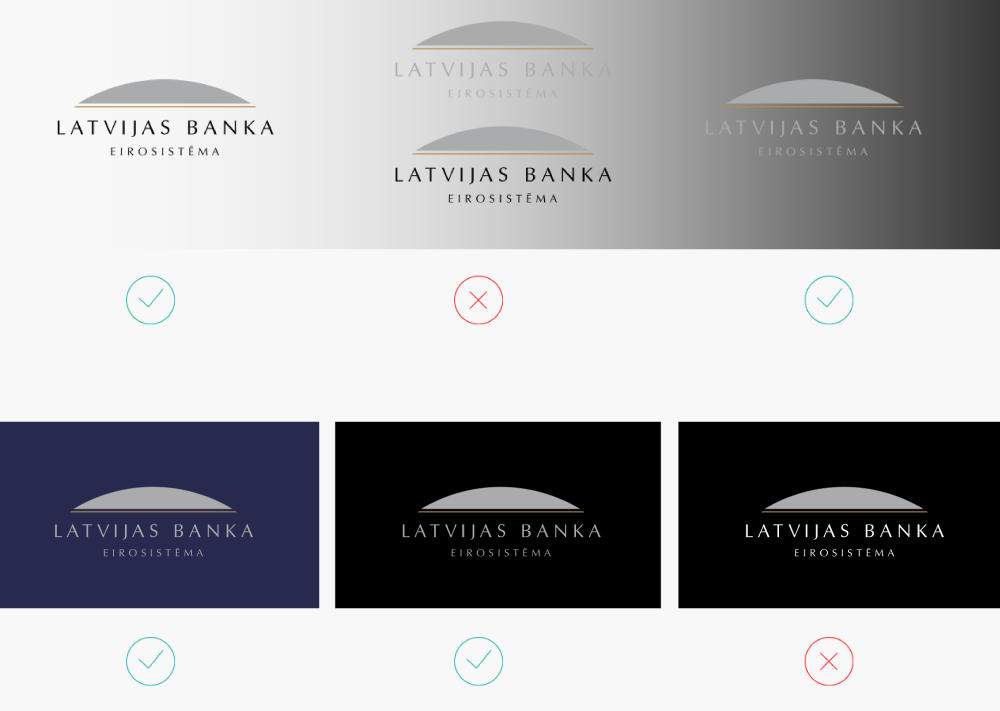
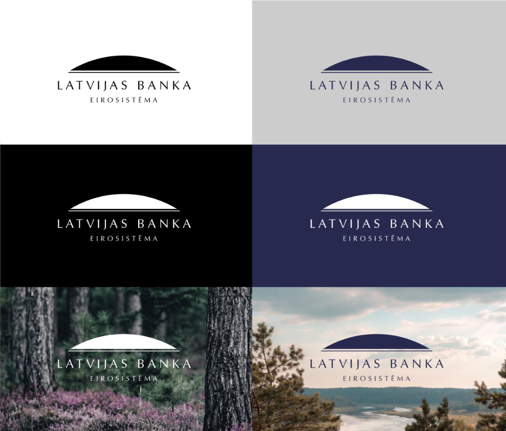
The graphic sign (logo) of Latvijas Banka is a registered trademark and property of Latvijas Banka. The sign must be displayed in accordance with the rules approved by Latvijas Banka.

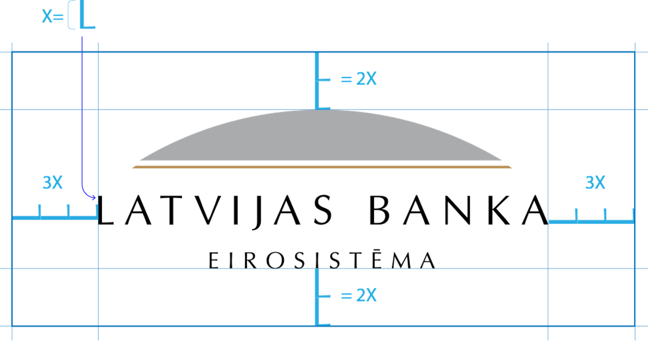
The logo is structured as follows:

the symbol + inscriptions "LATVIJAS BANKA" and "EIROSISTĒMA" = the logo.

The key element of Latvijas Banka's logo design – the symbol of Latvijas Banka – is a segment of a circle with a line indirectly continuing in the inscription, thus evoking a sense of the circle's continuity. The basic idea of the logo is development and movement towards a perfect shape.

The symbol of Latvijas Banka is designed in gold and silver – Latvijas Banka's signature colours. While both colours are intertwined in the sign, gold holds a higher position in the hierarchy. To highlight the special significance of gold, it is used proportionally less in the logo. The inscription is in black, a neutral colour.

Permissible colour options

The logo's full-colour version takes priority. It is intended for use on a dark or light background. It should not be used on a background of medium intensity as the logo will blend in.

When using a dark background, letters in silver instead of black must be used in the logo.


Latvijas Bankas logotips krāsas

A monochrome version must be used when the full-colour logo is not feasible as well as in photographs. A reverse logo is permissible on dark backgrounds. A monochrome logo may be black, white or dark blue.

Latvijas Bankas logotips krāsas


The height of the letter "L" serves as the measurement.

From left and right – at the height of three horizontally placed letters "L". From top and bottom – at the height of two vertically placed letters "L".

Latvijas Bankas logotips drošības laukums

Minimum size

In printing, the minimum recommended width is 30 mm, while the minimum permissible width is 20 mm.

In the digital environment, the minimum recommended width is 250 px, while the minimum permissible width is 170 px.